The research phase enabled us to determine the design drivers of the project.
Firstly, the website would have to connect both sides of the sales/buying process. On one hand, it would prepare the potential buyer for the buying process in an easy, approachable way. The website would have to be a trustworthy platform that would provide the user with the information they need beforehand and help them to be prepared before they walk into the dealership. On the other hand, the website would allow us to gather data about the users. This data would help Buster and their dealers to better serve their customers’ needs.
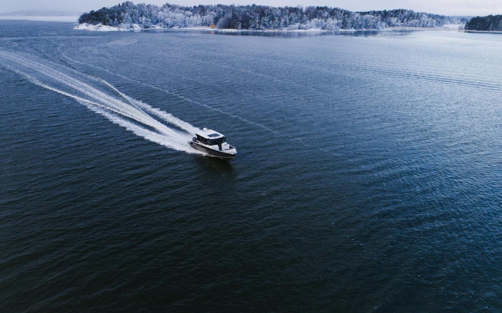
The design of Buster boats is guided by uncompromising goals regarding ruggedness, everyday practicality and seaworthiness, and the website would have to communicate these values.
Secondly, the guiding driver for us would be the user flow. There would have to be a smooth flow through the site for each of our user profiles. This would guide the website's structure. Every page on the site would have to have a clear purpose. Whenever we faced a design choice, we asked ourselves – does this selection support the user flow?
The design of Buster boats is guided by uncompromising goals regarding ruggedness, everyday practicality and seaworthiness, and the site would have to communicate these values. We came up with a slogan, “Perfection in utility”, that would guide the tone of voice and visual style throughout the site.


